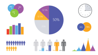
This blog is about exploring infographics and creating one.
An infographic is a graphic representation of information that helps users
visualize the “big picture” of an idea that might otherwise be difficult to
understand. After looking into several
different sites, I decided I liked Piktochart.
Piktochart is a one- stop shop for building, designing and customizing
visually attractive infographics. It is an easy app that requires very little
effort to produce beautiful, high quality graphics. By using infographics you
can create, build an infographic collection, connect infographics with
standards and market you school or school library.
The infographic I decided to
do with information by PewResearchCenter is from a survey they conducted March
17-April 12, 2015, and Smartphone data based on Pew Research survey conducted
on June 10- July 12, 2015. The information represented is about Technology
Device Ownership:2015. It shows that cellphones and computers are the most
commonly owned devices.
It also shows the percentages of U.S. adults who own
each of the following devices: cellphones, smartphones, desktop/laptop
computers, tablet computer, MP3 player, game console, e-book reader, and
portable gaming device.
Here is the link to my infographic:


Great post, Buffie! I think it will be so interesting to use infographics with the kids. I love that they will all be unique.
ReplyDeleteThis is great information Buffie! Infographics are a good way to bring statistics to life in a way that will capture student's attention.
ReplyDelete~Valerie Daigre
Well, I have every one of those devices in my house. We don't use them all (gaming systems) but we have them. I wonder why they didn't lump cell phones and smartphones together in the first place since they did first and then noted specifically smart phones later.
ReplyDeleteThanks for sharing piktochart.
Hi Buffie,
ReplyDeleteYours was a nice explanation of the power and promise of infographics. I was most appreciative of your choice to create color variance to enliven the presentation. Is there any way to tint the text background color? The contrast between the black background and the bright posting muted a few of the softer colors.
Nice work.
-Johtell
Great job on your infographic. I love the color scheme you used and how it made your infographic neat and clean.
ReplyDeleteThis was a good example of the use of color to help the reader see what goes together and what is different information, starting with the text of your blog! Nice!
ReplyDeleteGreat information in your infographic! I love the color scheme that you used. It is very inviting and grabs the reader's attention.
ReplyDelete